Email Best Practices
You've Got Mail 📨
Emails are really at the core of what we do as a business. They are the way we inform, connect, and catch up with prospects.
When creating marketing emails, it's important to keep in mind our brand voice, colors, and established design elements.
Best Practices for Emails
Clear Language
Keep your copy concise - shorter, more concise copy is better for both accessibility and UX.
According to research by Litmus, the average attention span in email is just 13.4 second. The ideal email length is just 50 words.
Use shorter sentences and also limit your use of jargon and difficult words.
Images
Keep in mind, it's preferable to use real text of images to convey a message. Images should be used for decoration.
Include alt-text for images that informative or are a CTA.
- Informative: Describe the information in the image
- Active: Describe the result of the action taken
- Decorative: Use an empty alt attribute
Never call to attention that it's an image - the screen reader already does this.
👉Always read the alt text aloud with the other content to ensure it makes sense
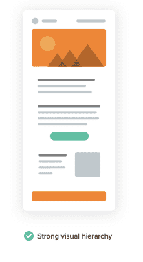
Strong Email Hierarchy
Cognitive and situational disabilities make it hard for people to read and understand long blocks of text.
By creating a hierarchy, it helps users quickly scan and consume the content in the email.
Use text size, color, and placement to create emails that are easily scannable.
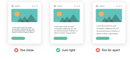
Also, make sure to allow enough whitespace between sections.
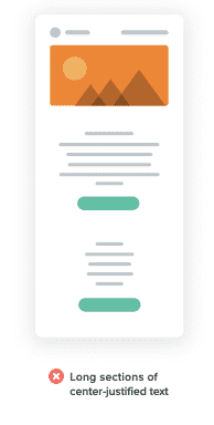
Use Left-Justified Text
When email copy is centered, it can be hard to keep track of where you are. Left-justified text provides an anchor for your eyes when jumping around an email.
Use minimum size font 14px
Bigger font is more readable on desktop and mobiles and create a better reading experience.
Line Spacing
Line spacing should be around 1.5 to 2.
Proper line spacing improves readability.
Keep Contrast High
Like in images, colour contrast is also important in email.
Email Layout
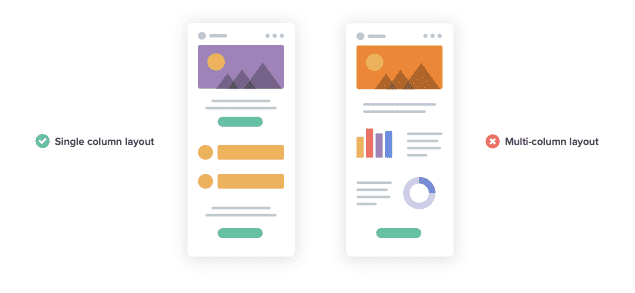
Simple email layouts are great for readability and clarity.
Choose single column layouts over multi-column layouts. Single column layouts enforce the hierarchy and are easier to skim.
Further more, single column layouts are easier for mobile accessibility.
Coding the Email
Only have one <h1></h1> tag. If you have more headlines, use h2, h3, h4...
For paragraphs attribute it with <p></p>
Also include the <html lang="en"> tag to tell the screen reader the language of the email.
<span lang="fr"> is used when you have multiple languages in an email.


