Website
Keyboard Navigation
Keyboard navigation is an essential part of accessibility. Many users rely on their keyboards to navigate webpages using the Tab key.
The Tab is going to focus on elements like buttons, links, images, and headings, then indicate to a screenreader the title/purpose of where you've landed.
Best Practices for UX & A11y
The easiest way to check if a webpage is accessible is to Tab through it and press Enter on the links.
The navigation order should be logical and intuitive. It should follow the flow of the page:
- left to right ↔️
- top to bottom ↕️
- header first → then main navigation → then page navigation → and then the footer
If an element cannot receive keyboard focus, include
tabindex="0"
⚠️3Play webpages should be keyboard accessible. Beware when using Hubspot or Unbounce as these are not always accessible.
Responsiveness
Responsiveness relates to the flexibility of a web page layout across devices.
Responsiveness lies in the code and targets the width of the user's web browser to determine what to display.
Best Practices for Accessibility
- Scroll bars must appear to fit screens on desktop computers
- On mobile, users should be able to zoom up to 200%
- Contrast levels on mobile may need to be higher (ration or 4:5:1)
- Columns should stack on top of each other in mobile view
-
When using a 3-column code, set widths with pixels not percentages
- 3-column code:
<div class="column" style="max-width: 360px;"> - 4-column code:
<div class="column" style="max-width: 300px;">
- 3-column code:
Landing Pages
A landing page appears in response to a click on a search engine, marketing promotion, marketing email, or other online advertisement.
The goal of a landing page is to lead to a conversion or action.
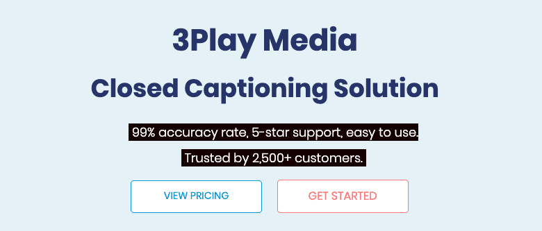
A good landing page:
- Has a clear CTA
- Is skimable
- Is eye-catching
- Is informative
- Is relevant to the previous action taken
- Stays within brand
Examples of 3Play landing pages include Adwords, webinar registration, and event registration.
Best Practices for Landing Pages
Make Your Offer Clear 👍
Think about where the viewer is coming from and then strategize your message around that.
Good landing pages are skimable. Let's be honest, most people aren't taking the time to read anymore.
-
Include a vivid CTA button
- Note: Button text should be descriptive and actionable.
- Use language that makes the prospect feel inspired, excited, smart, and appreciated
Simplify the Landing Page 👍
Pay attention to what is above the fold. Make it:
- Visual
- With a strong headline
- Brief description of benefits (1-2 sentences)
- Clear CTA button
- Beautiful, relevant imagery
Add Testimonials 👍
Include customer testimonials whether it be a tweet, quote, or G2 crowd review
Optimize for SEO 👍
Incorporate the keywords into the title, headline, body text, image alt text, and other places where it fits.
Don't forget to include meta description information as well.
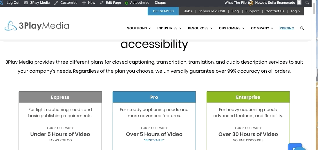
Make it Accessible 👍
Check for keyboard accessibility, color contrast, responsiveness, and flow.